
Contrast & colour
“Perception is a highly selective process — not only in the sense that it concentrates on what attracts attention, but also in the way it examines an object and handles it. The camera records every detail with equal precision; perception does not.” — Rudolf Arnheim
Thus a person takes in any image by singling out the objects that matter to them. The main way we study an image is by analysing its contrasts. And so, the more types of contrast are combined in a single image, the more attention it draws.
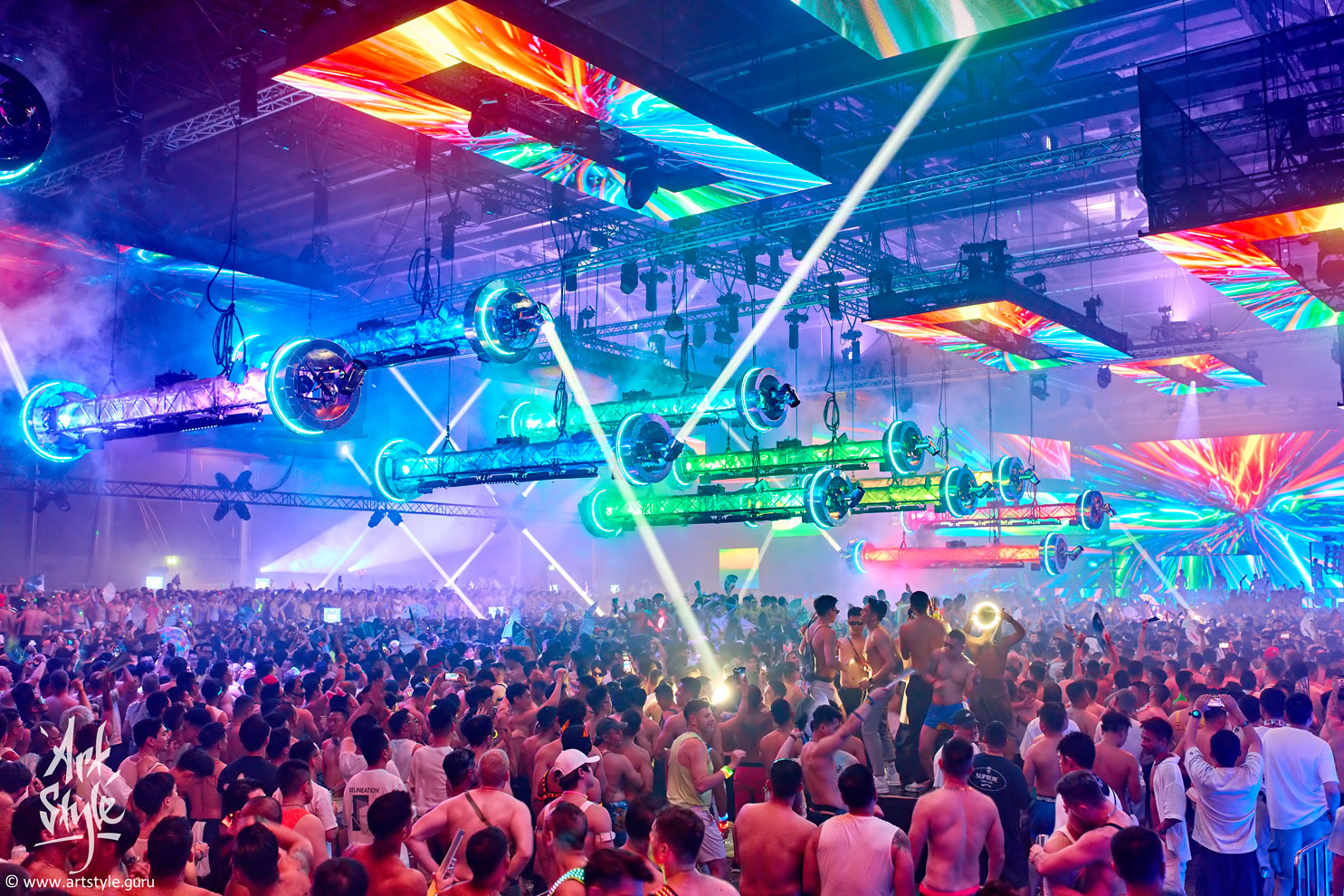
Photography has five kinds of contrast, and I'll list them in order of rising expressiveness — and, with it, rising difficulty: contrast of form, of size, of light, of colour and of meaning. In this frame the work is done mainly by colour and size — with a little light and meaning besides.
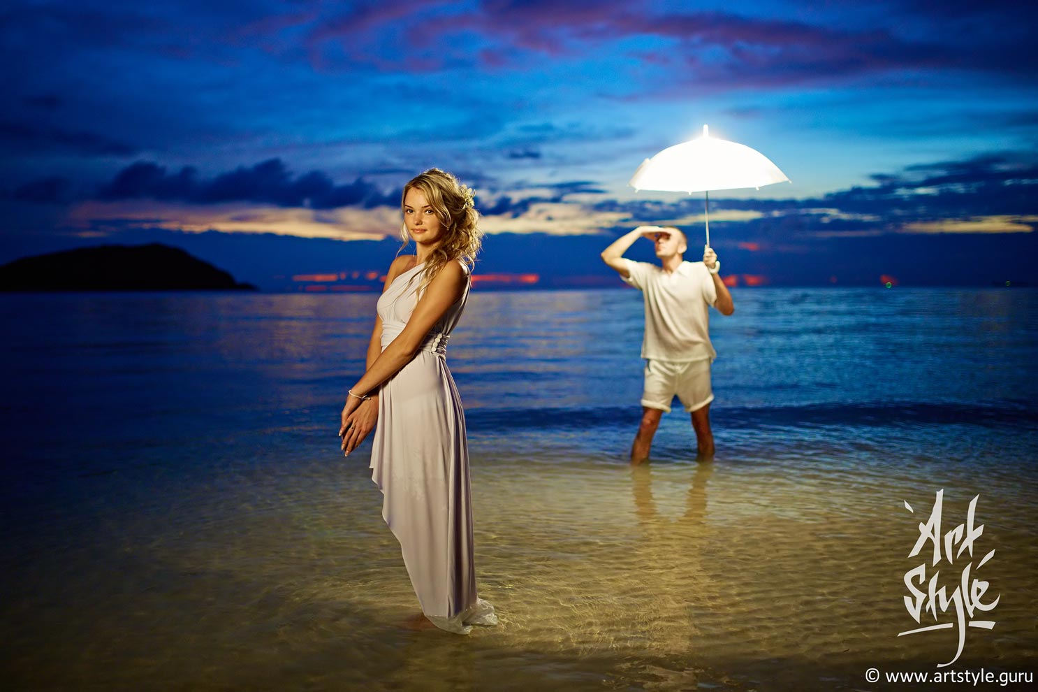
And here's a clear example: this frame brings several contrasts together at once. Light — the glowing umbrella against the deep dusk of the blue hour; meaning — an umbrella that gives light instead of shade; colour — the warm glow against the cool blue. And a 35mm lens wide open adds a moderate contrast of form and size. Bingo — a rare frame that has all five kinds of contrast at once!
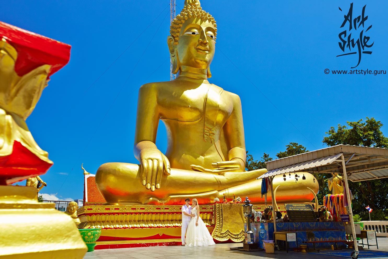
Here the impact rests on two devices: size contrast (objects of different scale) and colour contrast — the pairing of opposite colours on the colour wheel, blue and orange-red.

The most magnetic contrast of all is the contrast of meaning. It's also the most elusive. Here is the idea of how one plus one can make three.
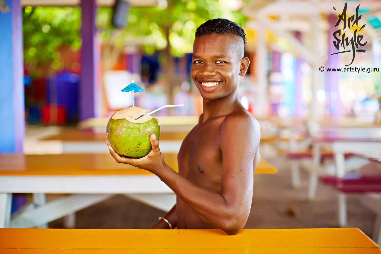
The brain prizes the contrast of meaning above the rest — but it's also the hardest to set up on a shoot. Here, happily, the coconut all but leapt into the fellow's hands of its own accord, so I scarcely had to think about the “spectacular shot” at all.
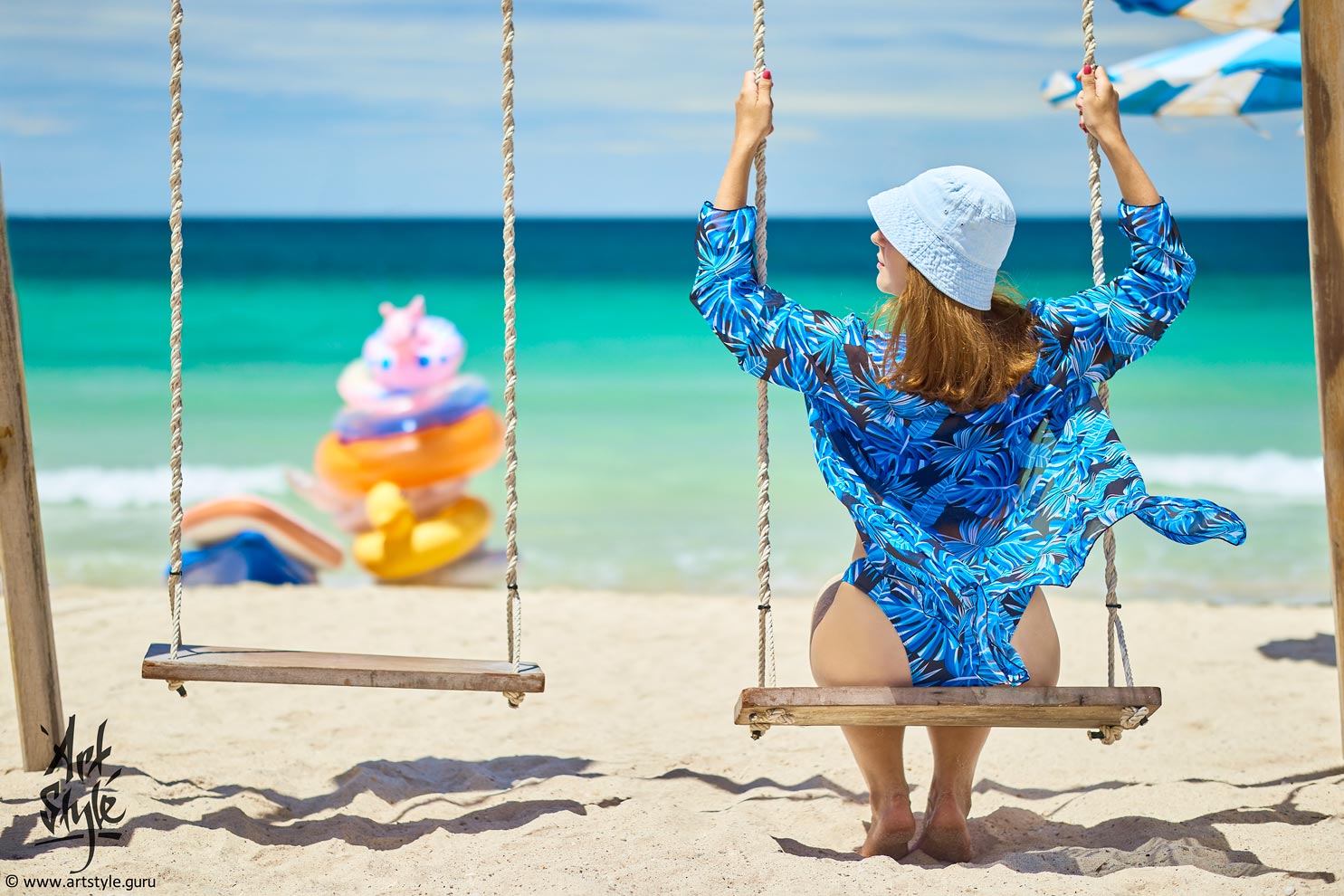
Now for colour itself. Colour contrast comes in three main kinds. Monochrome — when all the shades are close in hue; it's loved in stylised work, fashion and art. The colour accent — when the main subject is set against everything else by colour; easy to catch in a close-up or to draw out in post. And polychrome — a riot of colour. Here it's monochrome, in blue.
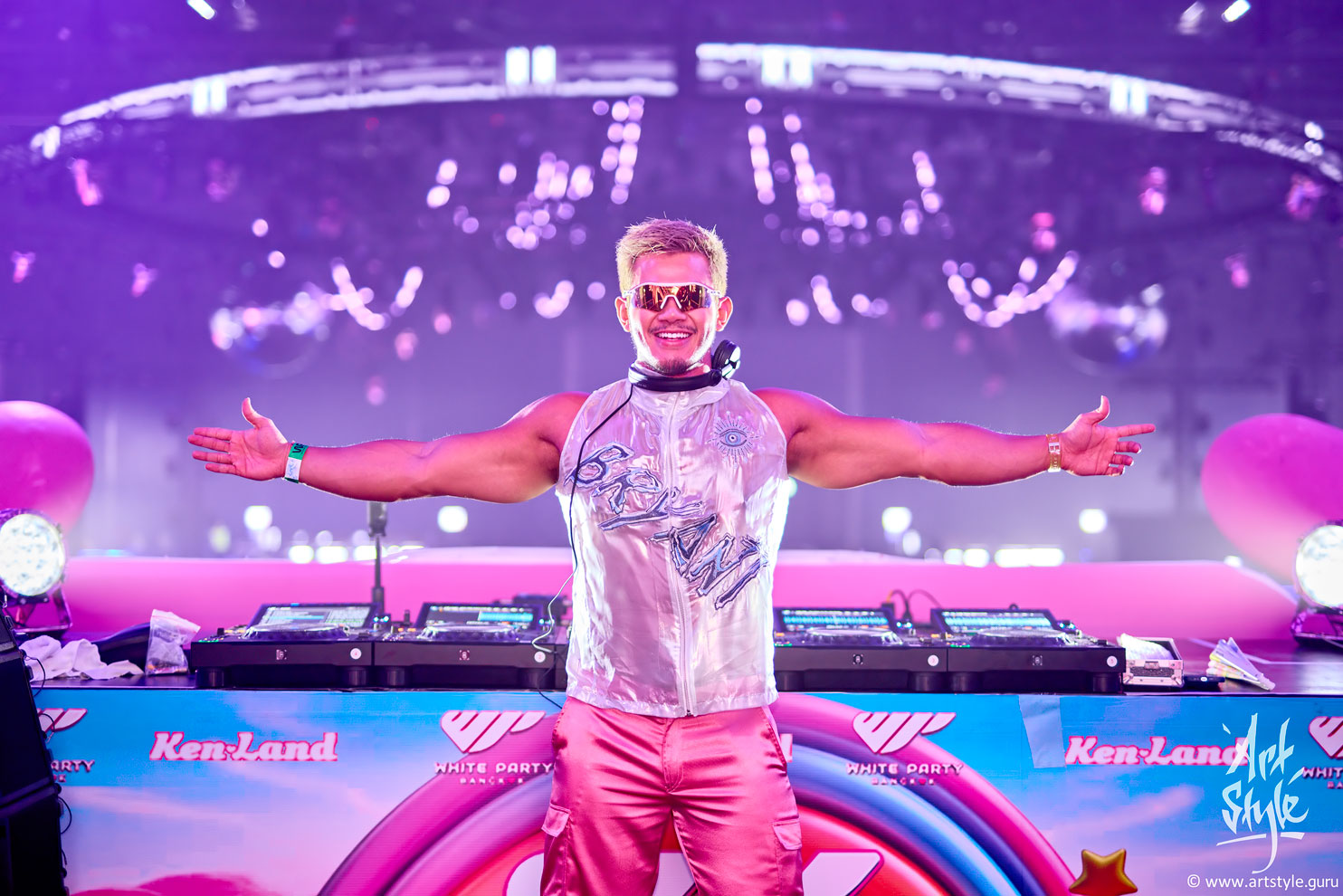
It may not be obvious, but this too is monochrome — with pink as the lead colour. In a monochrome composition colour acts as a unifying force: through its own gradations it underlines the frame's coherence and the richness of its undertones.
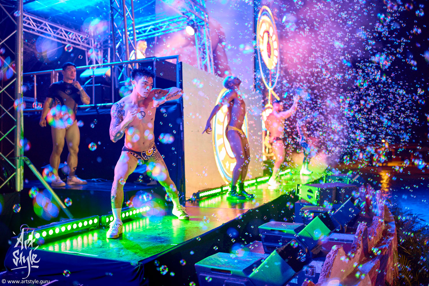
Colour contrast is among the hardest to pull off. Here it's built on an opposite pair from the colour wheel — light green and pink — held together by the blue that sits, on the wheel, exactly between them.
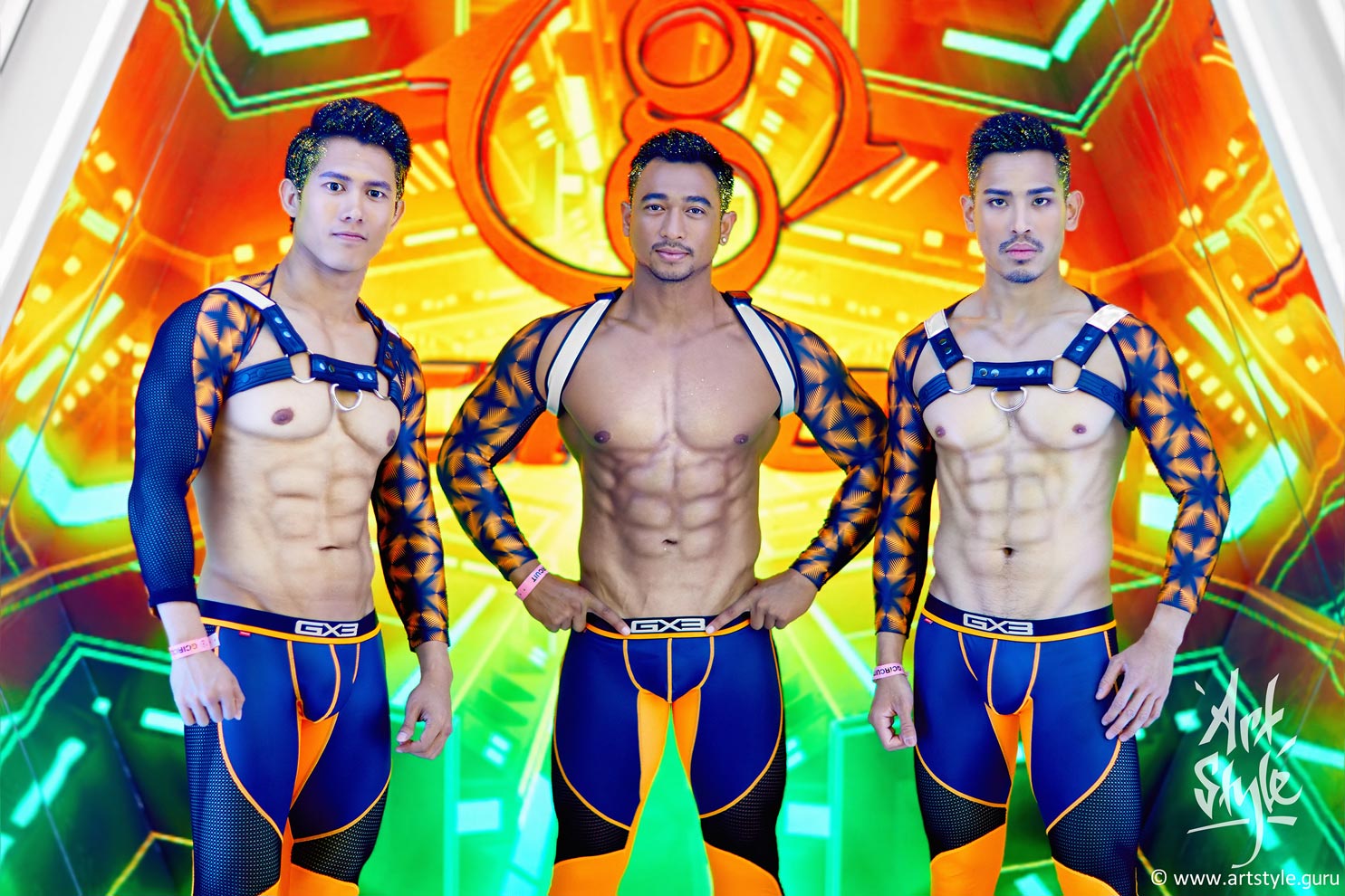
I realise your eye here is fixed on anything but theory — on the abs, that is — and yet let me note: the frame works thanks to a pronounced colour separation; yellow-orange and violet-blue stand opposite each other on the colour wheel.
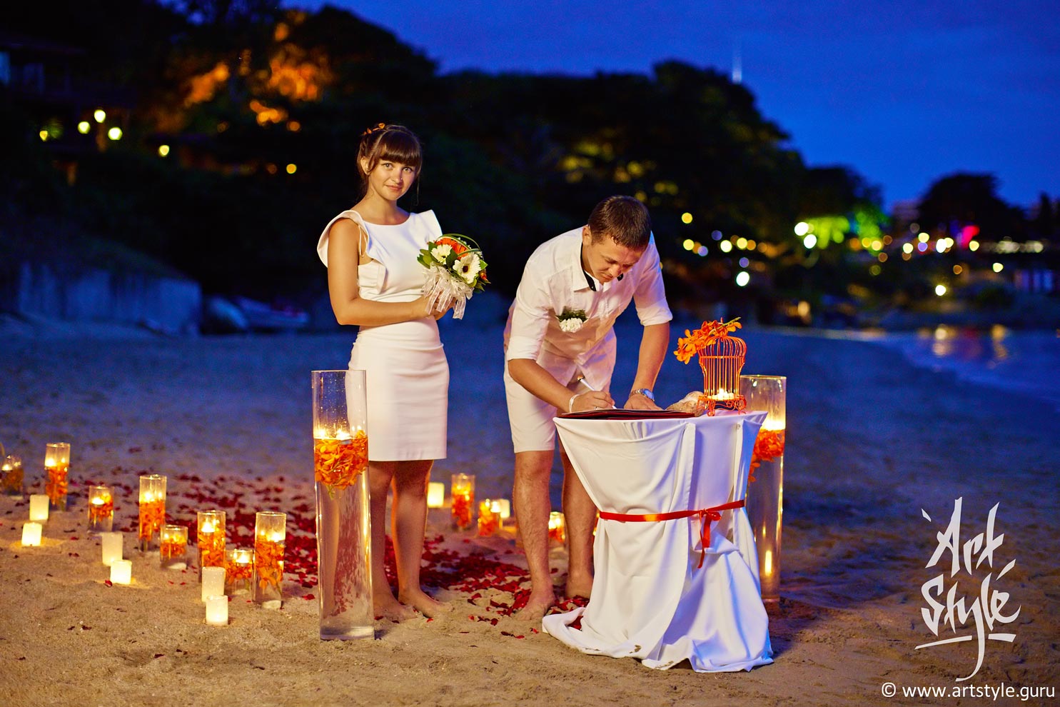
A frame's impact is lifted not only by a blurred background and a well-lit subject, but by colour separation too. Here the opposing orange and blue help to lift the newlywed couple still further off the background.
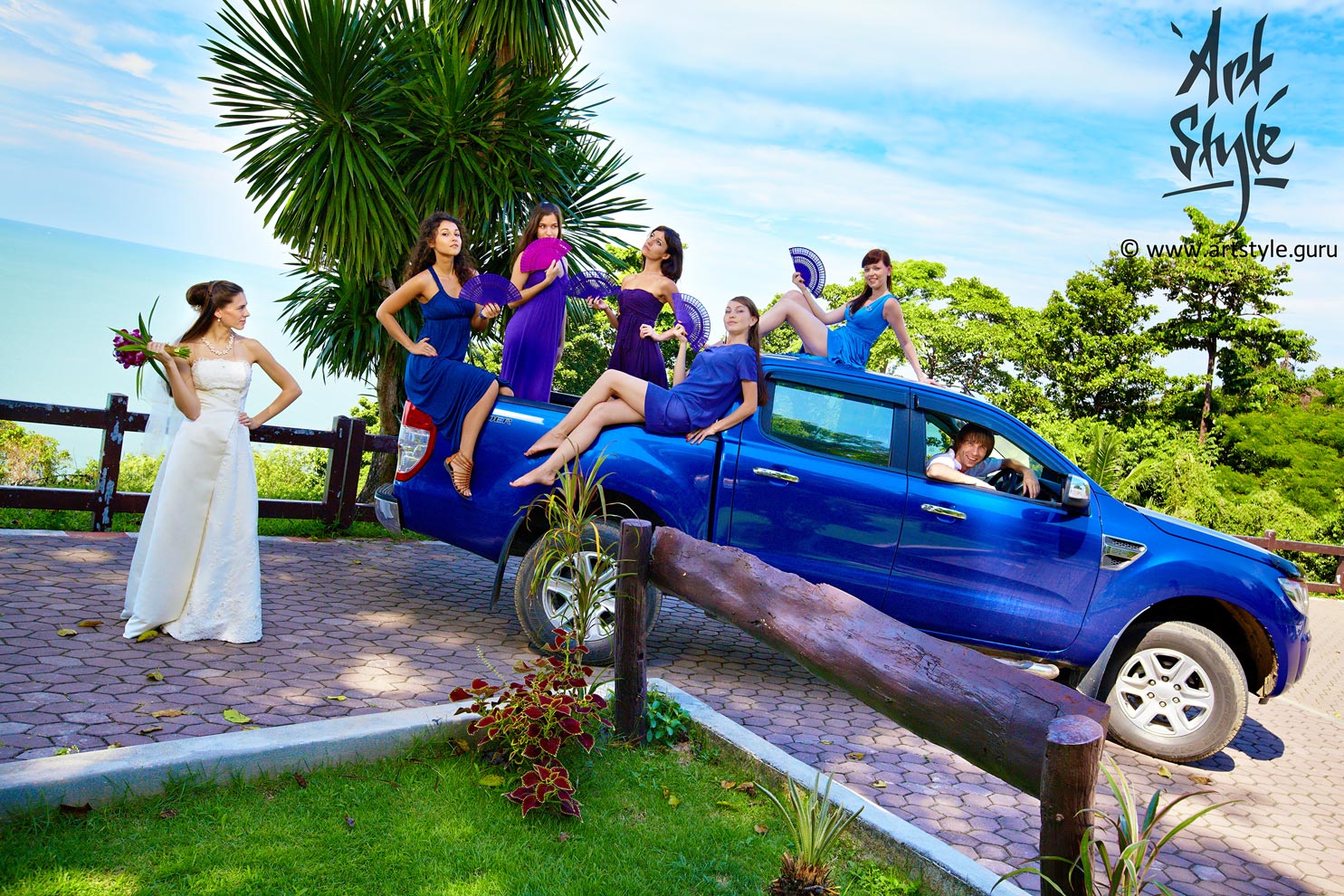
Wedding shots look best of all when every element keeps to a single colour scheme. At this wedding the blue-violet range covered not just the dresses and the bridesmaids' fans, but even the pickup truck the groom ferried them about in.
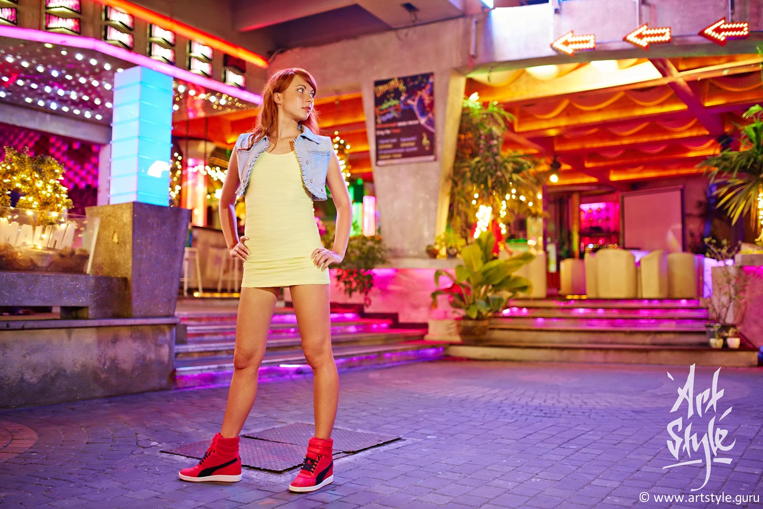
I'm often asked why I push the saturation so hard in Photoshop. I don't: I simply shoot so the frame is exposed as fully as possible, and in post I only bring the brightness down a touch. Because colour appears exactly where there is plenty of light.
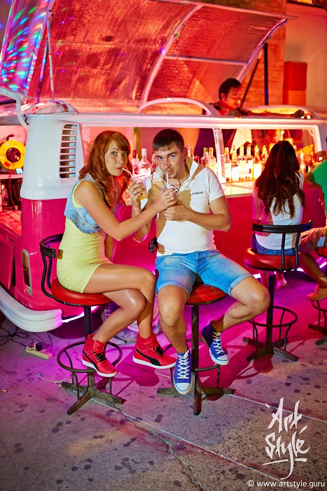
Shooting Pattaya nightlife is technically tricky — there's little light — but rewarding. The thing to remember: bright colours come only with fast lenses and sufficiently long exposures. Because where there's light in the frame, there's colour too.