
Composition: angle, rhythm & subtraction
Composition is the art of arranging things. And, even more, the art of leaving things out. Below are a few working principles: where to place what matters, how to steer the viewer's eye, which angle to choose, how rhythm works — and a couple of special devices to finish.
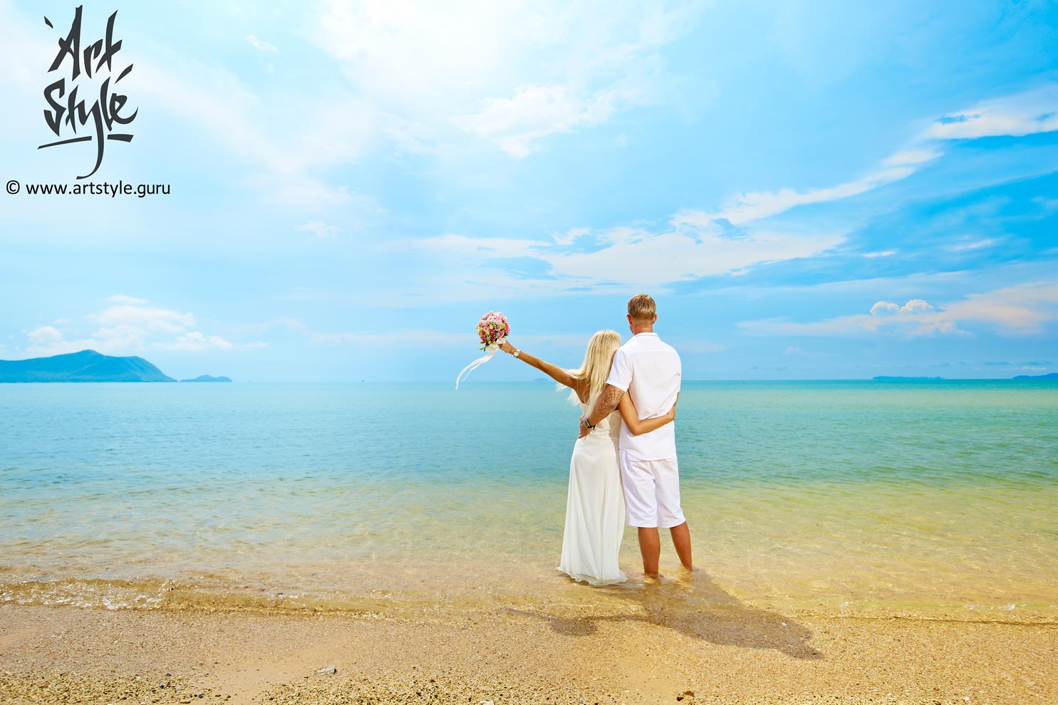
It's often said that perfection is when there's nothing left to add. I'm convinced of the opposite: perfection is laconic. Perfection is when there's nothing left to take away.
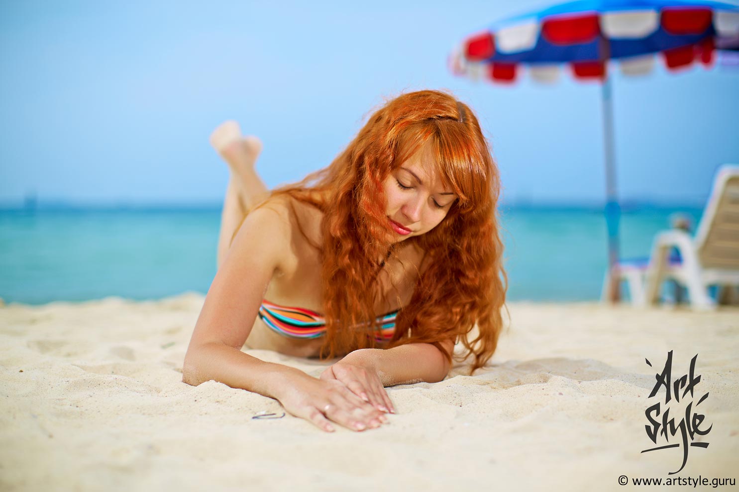
In a portrait this rule applies to the letter: the whole job of the frame is to lead the viewer's eye to the person. Many photographers forget it, and the frame fills up with details that do nothing but distract. Everything superfluous has to go.
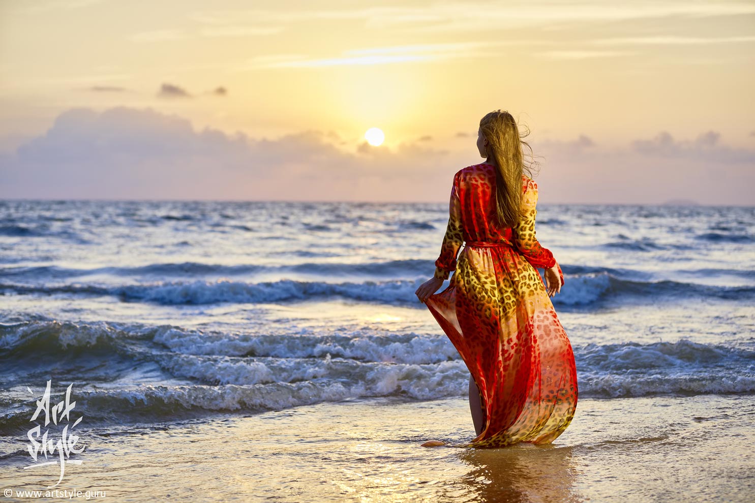
This frame's impact rests on a simple device: the key elements — the model and the horizon line — sit on the vertical and horizontal lines of the golden ratio, and the sun on the frame's central section. All of these are particular cases of a more general rule — that of harmonic sections.
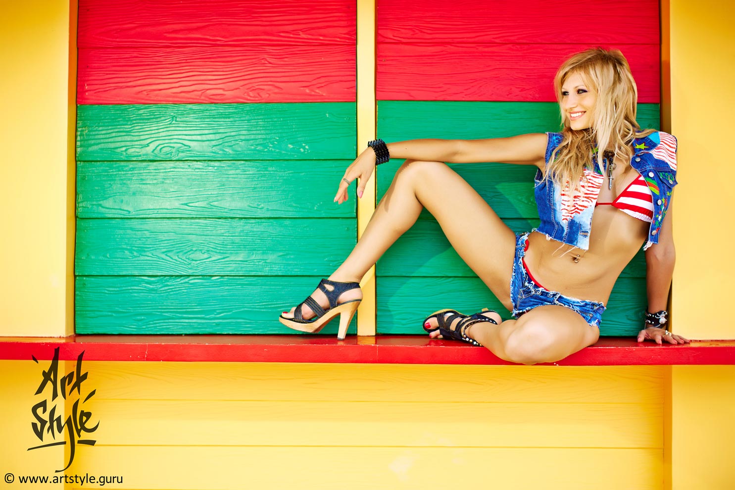
The easiest way to stress what matters is to keep it sharp and blur the rest. But professionals more often do it another way — with colour and composition.
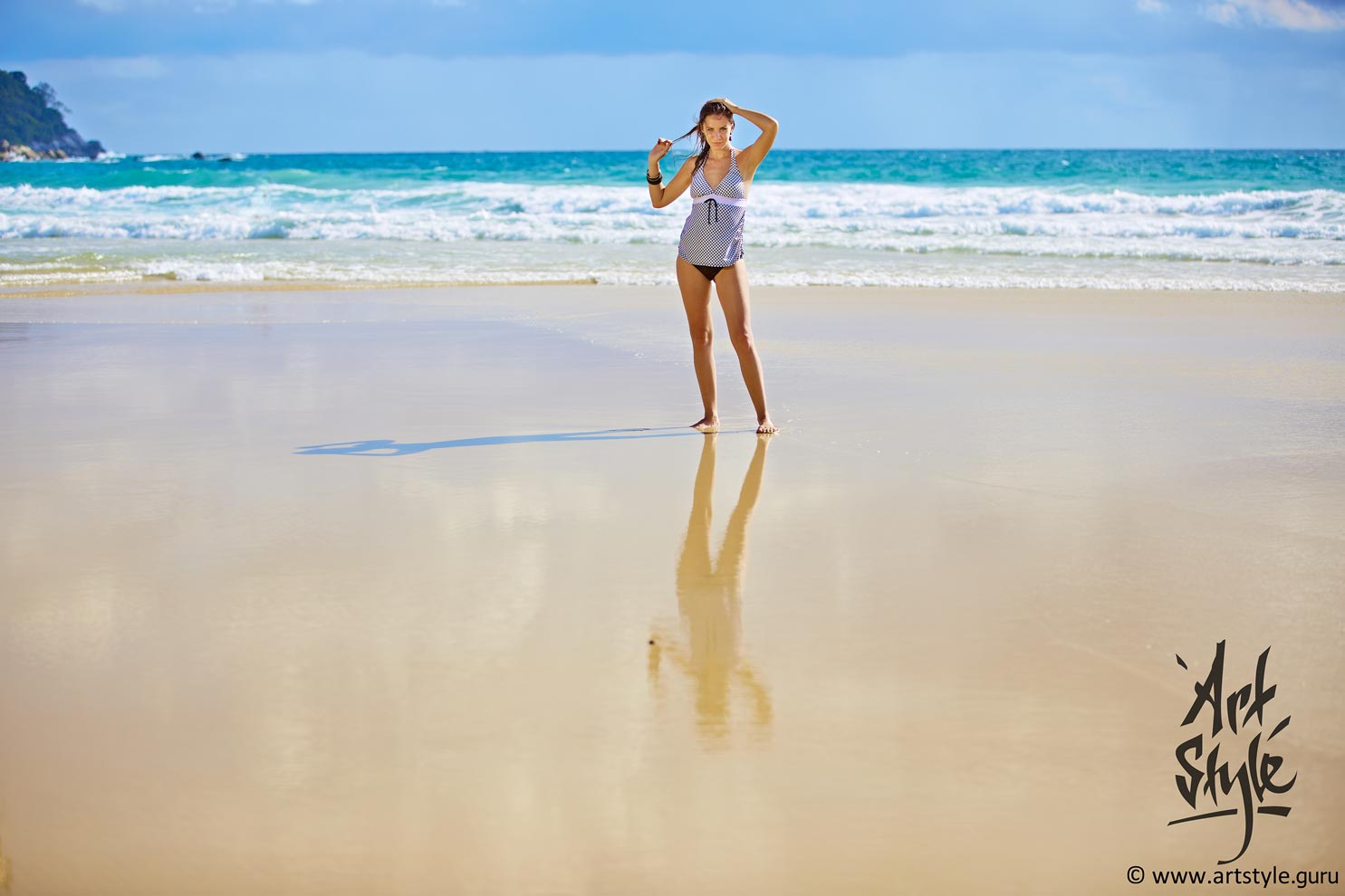
When the background is simple enough, you can put shadows and reflections to work. In a shadow the mind instinctively hunts for extra information about the object — its size, density, relief; in a reflection it catches the resemblances and the differences from the original. And so the viewer's attention is held.
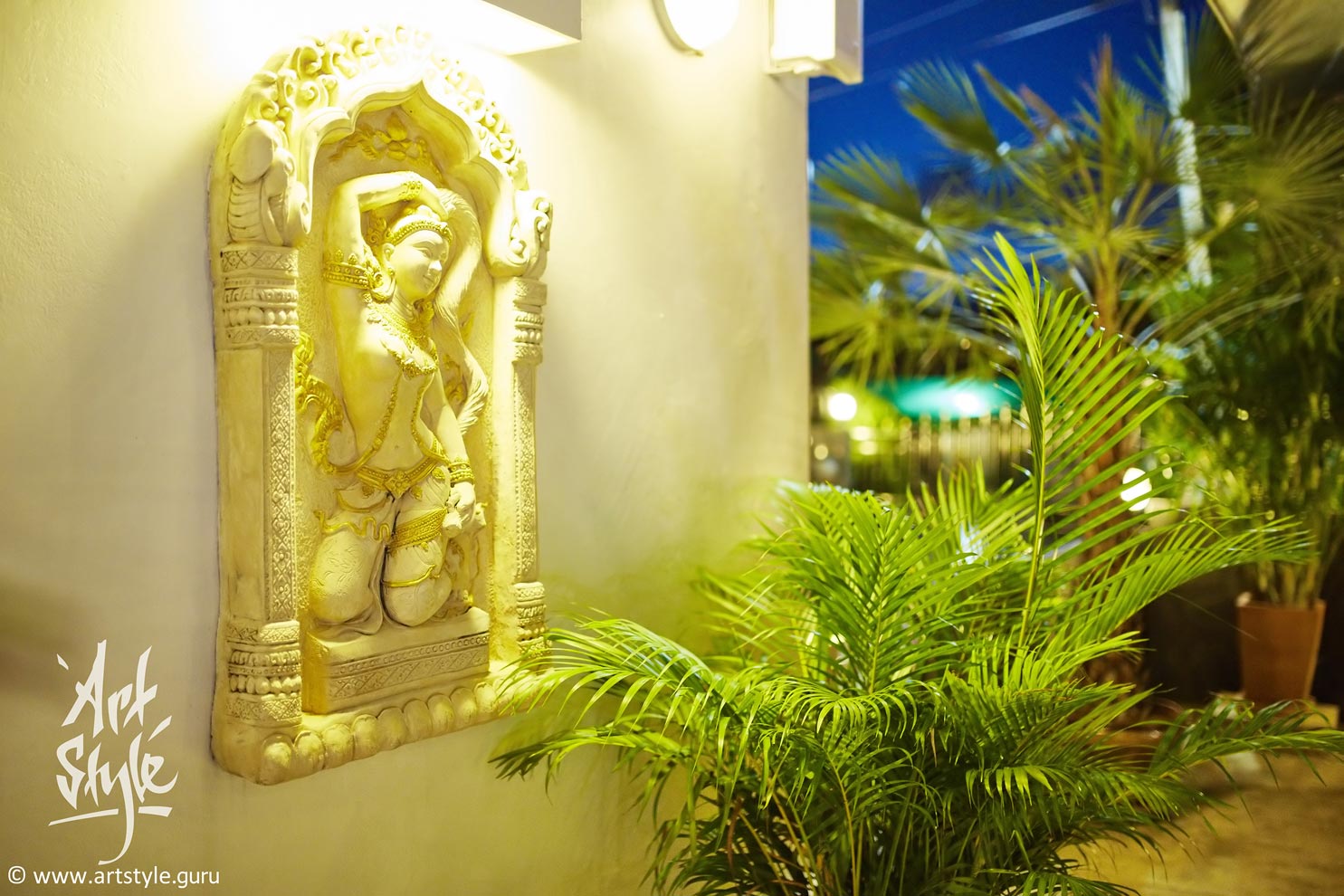
A close-up is more expressive when the frame keeps a reference to the whole it's a part of — so the secondary objects shouldn't be blurred away completely. The ideal focal lengths for a close-up are precisely the wide and moderate ones (24-50 mm), though most people, out of habit, reckon the portrait 85-135 mm range the best.
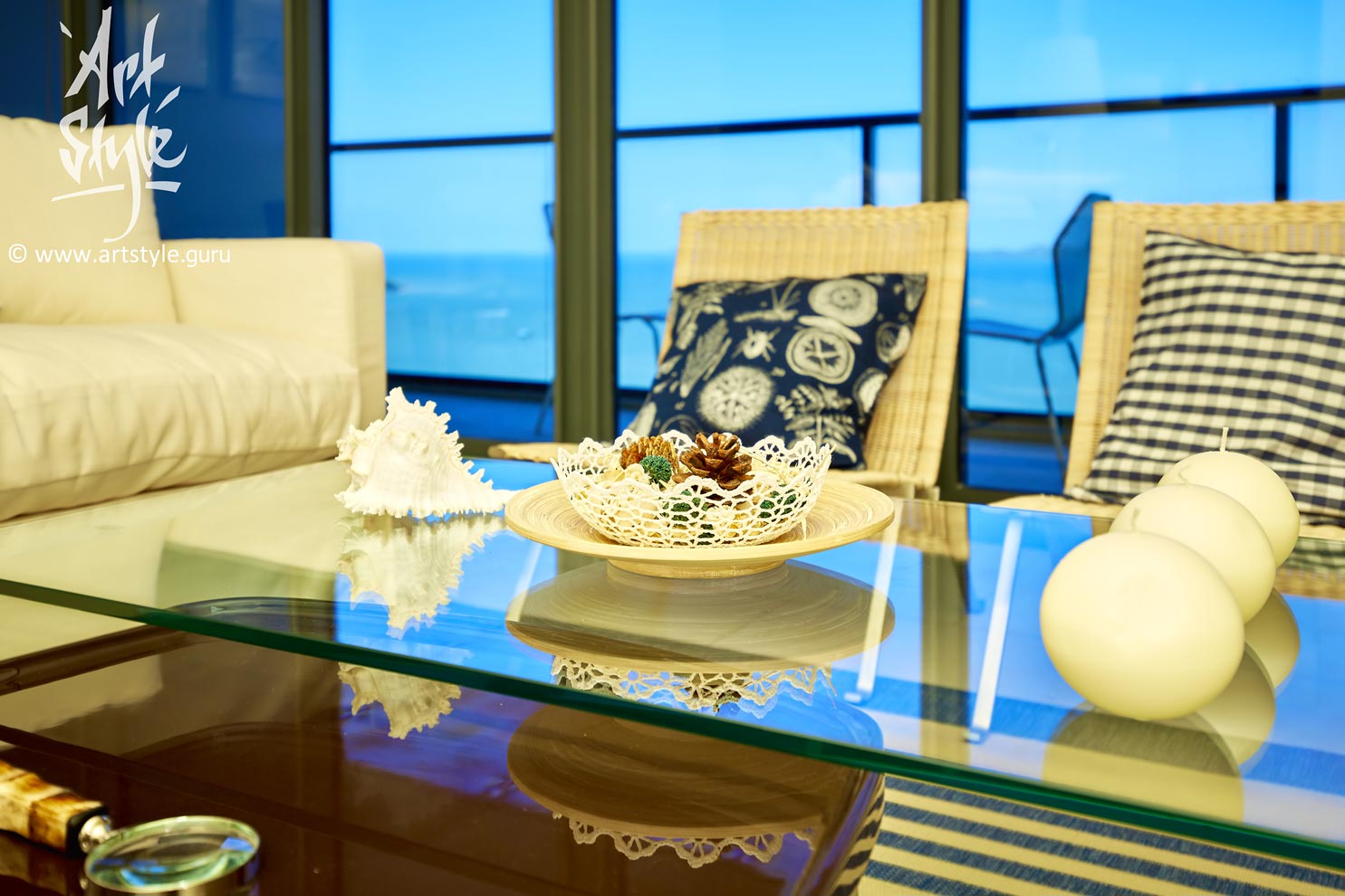
The reason is the same: with a wide angle you can still see which part of the object you've shot close. A telephoto blurs the background into unrecognisability — and it becomes impossible to tell what the fragment even belonged to.
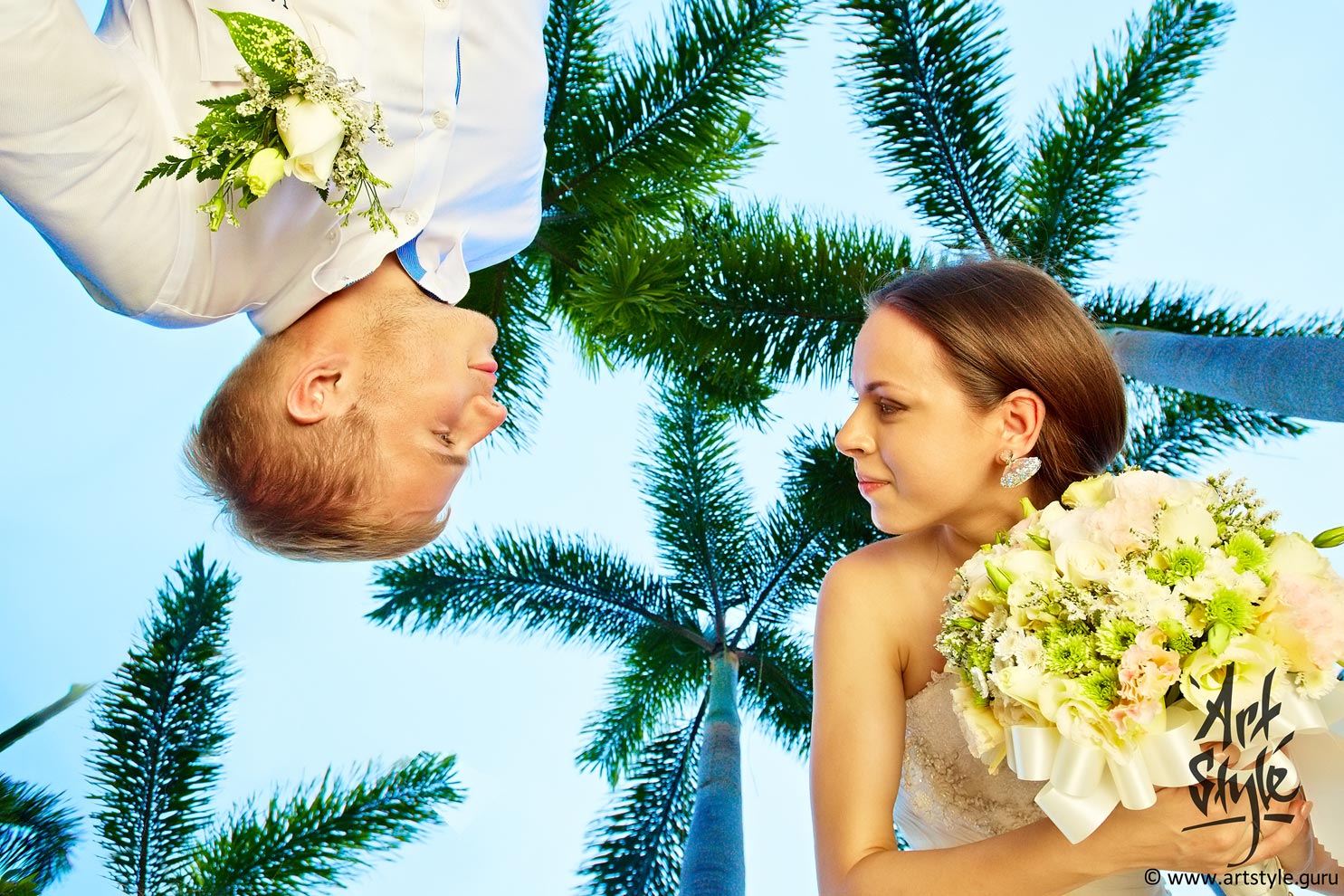
One of the tasks a photographer has to solve right there during the shoot is the choice of angle. A well-chosen angle makes a frame unusual and memorable.
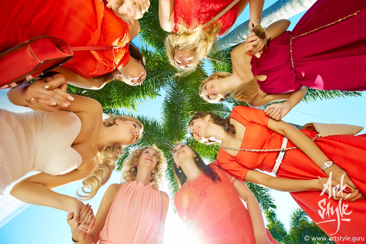
One sure way to catch the viewer is an unfamiliar angle. The photographer shows the everyday from an unexpected side and lets us see new facets in familiar things. That's exactly what makes such frames valuable: they enrich the viewer's own experience a little.
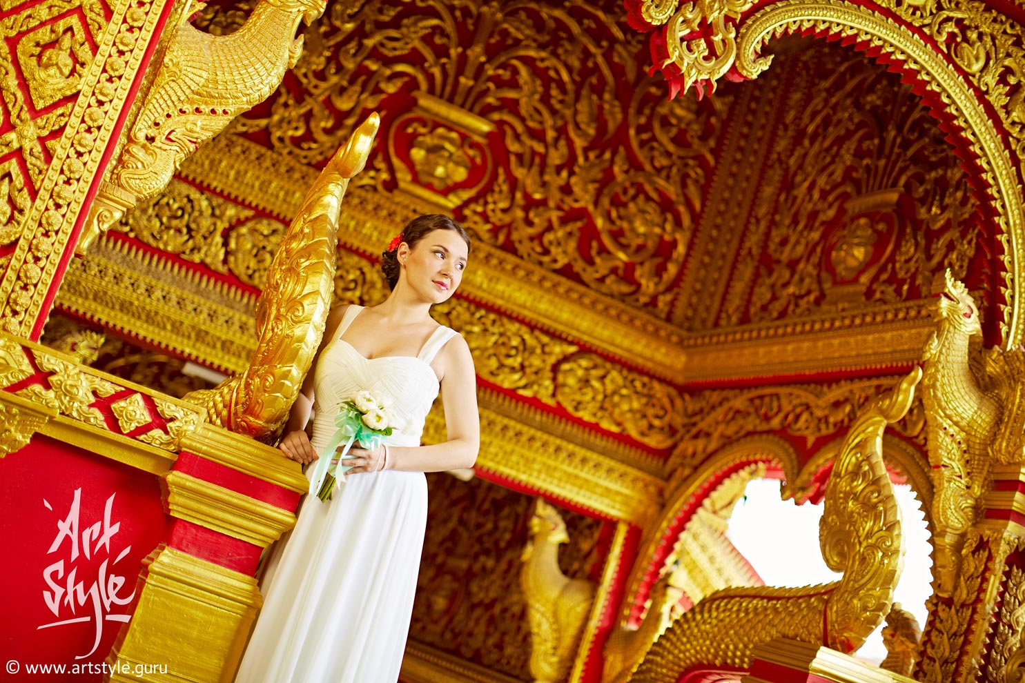
Amateurs often make a classic mistake — the “slipped horizon.” But rules exist to be broken: professionals will now and then resort to a trick called the “Dutch angle” — a small but distinct tilt of the frame that, under the right conditions, lends the shot dynamism. Usually it's about twenty degrees clockwise.
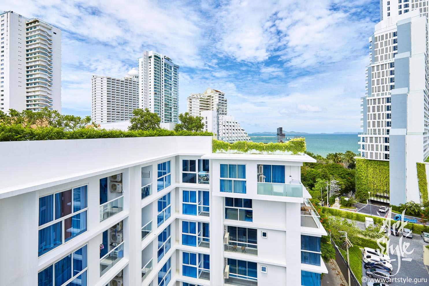
One of the strongest devices in architectural photography is rhythm: the repetition and movement of elements that give the eye's path a direction. Five kinds are usually distinguished — regular, irregular, progressive, flowing and syncopated (broken); two of them are at work here. The irregular kind repeats similar elements with variations in size, shape, spacing and colour: it adds dynamism to a frame. The progressive kind is a gradual change in size, shape or spacing: it creates a sense of movement and leads the eye from one element to the next.
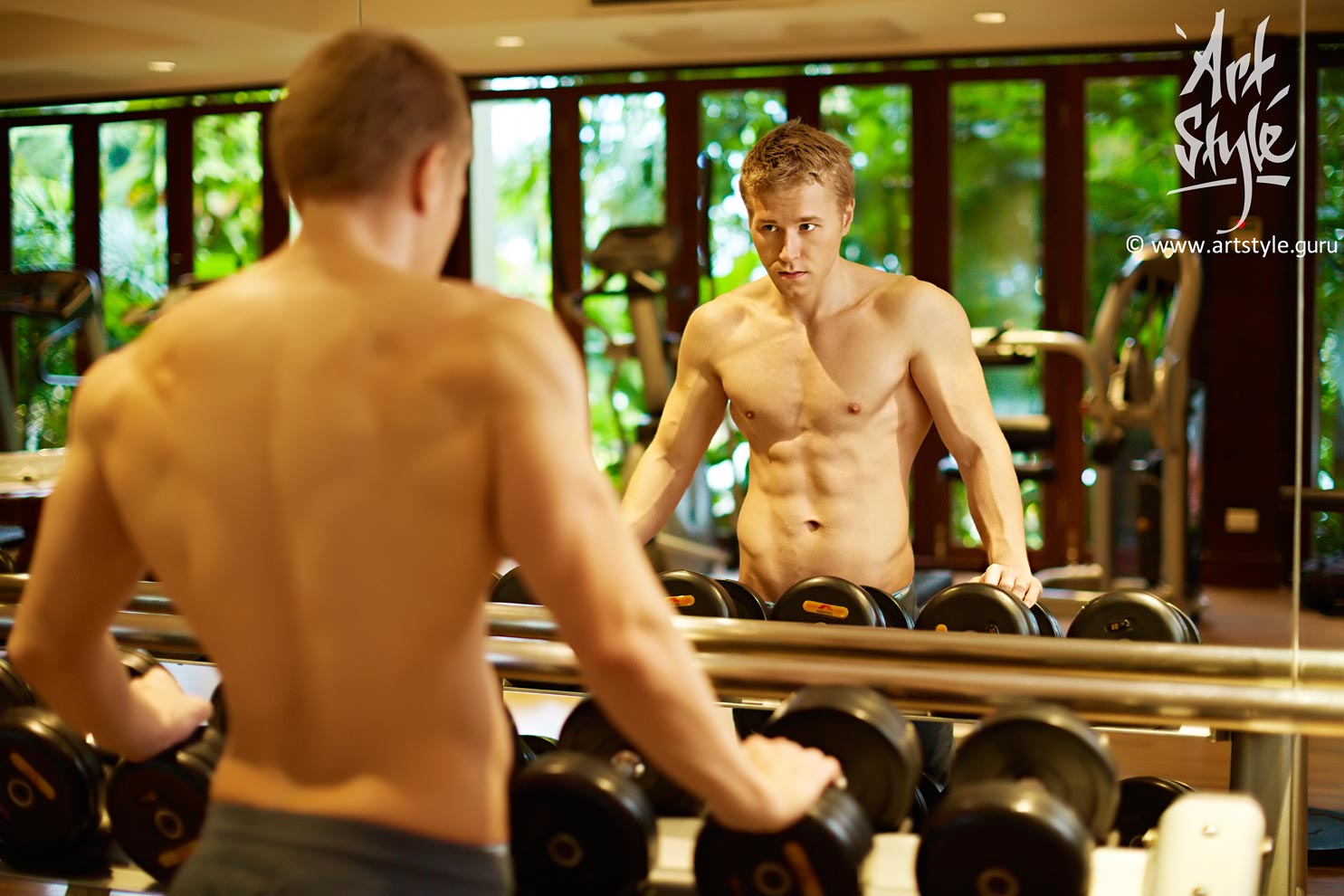
A mirror is a unique way to show a person from several sides at once within a single frame. It does take particular care and experience, though: the trick is to keep both the photographer and the gear out of shot.
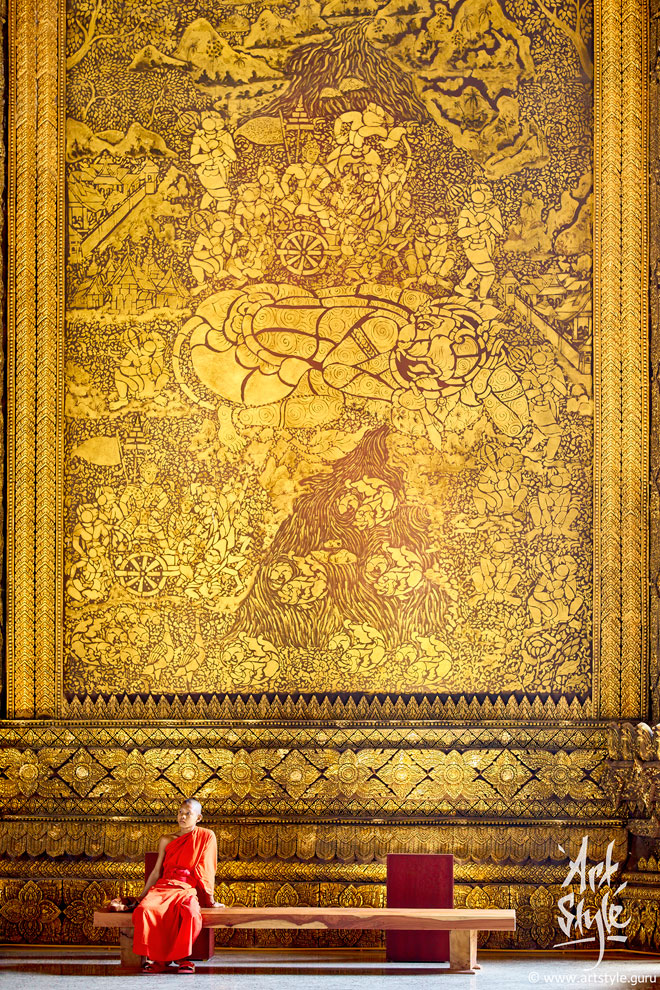
The Lao Art Museum in Vientiane. In this composition the foremost task is to convey scale correctly. To capture the true, cyclopean scale of a hall like this, you need two things. First, a telephoto lens: it gives an almost axonometric projection, with no error in rendering scale. Second, an object whose dimensions everyone knows — here, the human figure. This frame was made with a 90 mm lens.